UX Website Audit: How to Improve Conversion Rates on WordPress

WordPress powers a massive share of the web, with a 42.5% CMS market share. However, there is a cost to scale. Founders and marketing teams need to understand, when using WordPress at scale, that traffic alone is not growth if users bounce before they act.

This guide is based on real audit frameworks used to improve conversion performance across WordPress websites.

How do you ensure users don’t leave before completing key actions?

A UX website audit helps gain measurable diagnosis, tying design, performance, and usability issues to revenue events. A structured website conversion audit helps you pinpoint churn points, which you can fix by using expert UI/UX design and development services.

In this guide, we break down practical strategies to improve conversion rates and optimize WordPress user experience. So, let’s get started with the ultimate WordPress UI/UX audit guide.

What is a UX website audit?

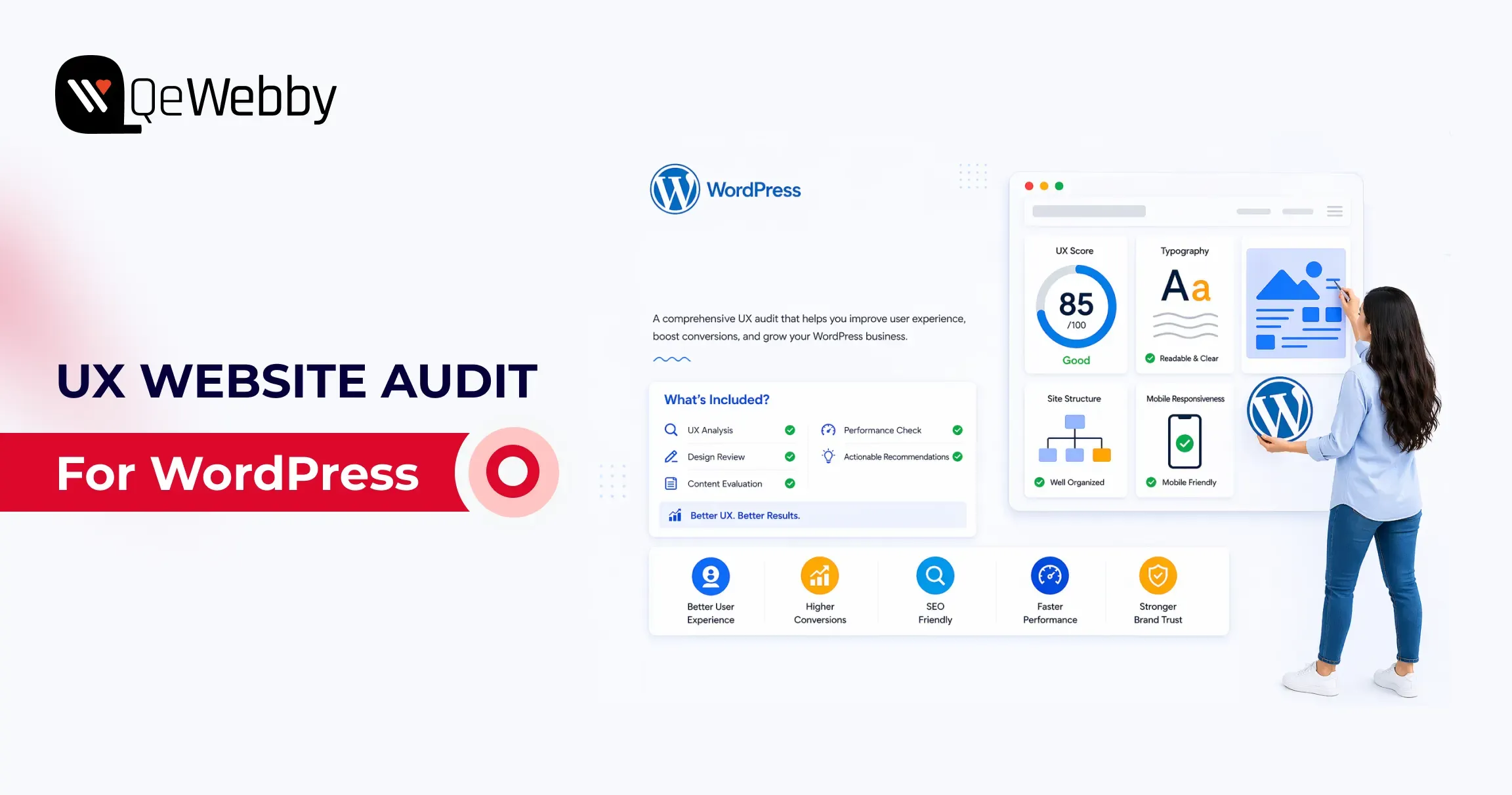
A UX website audit is a structured analysis of user behavior, performance, and usability to identify where users drop off and how to improve conversion rates.

Start a WordPress UX Website Audit by Defining Conversion Goals

A conversion goal is a measurable action tied to business value, not a visual preference. For lead generation sites, macro conversions include demo requests, consultation bookings, and form submissions. For WooCommerce sites, macro conversions include completed purchases and checkout completion rate.

Micro conversions matter because they predict macro outcomes. Track add-to-cart rate, pricing-page views, click-to-call actions, scroll depth, and newsletter signups as leading indicators. Google’s documentation on GA4 purchases and eCommerce reports, and key events setup, gives the minimum event architecture you need before auditing UX.

If GA4 key events are not correctly configured, your audit is mostly guesswork. You might improve aesthetics and still lose revenue because no one measured task completion in the first place.

Audit the First 5 Seconds: Consent UX and Privacy Friction

Before a user ever sees your value proposition, they interact with your compliance layer. Large companies live and die by GDPR and CCPA, but poorly designed cookie banners are massive conversion killers.

Audit your Consent UX:

  • Does the banner block the Largest Contentful Paint (LCP) on mobile?
  • Is the opt-in seamless, or does it force users to hunt for the “Accept” button?

If your privacy compliance frustrates users immediately, your bounce rate will spike before the user even begins their journey.

Analytics Shows Where Users Leave, UX Analysis Explains Why

Analytics shows symptom location, not root cause. A drop on a contact page tells you where failure occurs, but not whether the issue is unclear value proposition, poor field design, weak trust signals, or mobile friction.

#1. Build a website conversion audit from GA4 funnel drop-offs

Start with the landing page report, device category split, source-medium quality, and funnel exploration. If paid traffic exists on mobile landing pages at a higher rate than desktop, you likely have mobile readability, hierarchy, or CTA visibility issues, not just “bad traffic.”

#2. Connect website conversion audit findings to user intent gaps

Map every high-drop page to the user’s job on that page. A pricing page job is not about browsing; it is about plan comparison and confidence-building. A contact page job is not reading; it is a low-friction submission that reassures about response time and privacy.

#3. Prioritize website conversion audit pages by revenue proximity

Review pages that directly impact revenue, such as checkout, lead forms, pricing, and high-intent landing pages. This is where small UX improvements usually return faster gains than broad redesign work.

What Is a Website Conversion Audit?

A website conversion audit analyzes user journeys, funnel drop-offs, and interaction data to identify friction points that reduce conversions.

Core Web Vitals Reveal Hidden Performance Friction on WordPress Sites

Core Web Vitals are user experience thresholds tied to perceived speed and interaction quality. web.dev defines healthy targets as LCP at or below 2.5s, INP at or below 200ms, and CLS at or below 0.1 at the 75th percentile.

On WordPress, performance debt often comes from heavy themes, page builder bloat, render-blocking scripts, oversized media, excessive third-party tags, and a weak caching strategy. The WordPress Hosting Performance Handbook is useful because it frames optimization as system design, not plugin roulette.

Poor CWV is not only an SEO problem, but it is also a trust problem. If the first viewport stalls, users infer risk before they read your offer.

What Is a Conversion Optimization Audit?

A conversion optimization audit focuses on improving high-impact areas like forms, checkout flows, and CTAs to increase task completion and revenue.

Mobile UX Often Determines Whether Visitors Ever Reach the CTA

According to report, 53% of mobile users abandon a website if it takes longer than 3 seconds to load.

Mobile-responsive means layouts technically resize. Mobile-optimization means users can complete tasks comfortably on small screens, with a clear hierarchy, readable type, and touch-friendly interactions.

  • Audit your mobile flow for menu depth, sticky header behavior, tap target sizing, above-the-fold CTA visibility, form fatigue, and friction caused by intrusive pop-ups.
  • Use Chrome DevTools and real-device checks because simulated tests miss thumb-zone and visual density issues.

Google’s mobile speed perspective and web.dev vitals guidance both reinforce that delay compounds abandonment. Most WordPress sites fail mobile not because teams ignore users, but because desktop-first blocks get stacked without mobile task prioritization. That is a design governance issue, not a single bug.

Forms and Checkout Flows Are the Highest-Value Audit Zones

Research from the Baymard Institute shows that the average cart abandonment rate is around 70%, often caused by complex checkout processes and poor usability.

Form and checkout design decide whether intent becomes revenue. Baymard’s checkout research and benchmarks are still the most practical evidence base for eCommerce teams, including the widely cited cart abandonment benchmark and checkout findings.

For lead-gen forms, reduce field count, clarify labels, use inline validation, and add contextual trust copy near submit actions. For WooCommerce checkout, support guest checkout, reveal costs early, simplify error recovery, and keep order review obvious.

A conversion optimization audit should prioritize these changes over cosmetic refreshes because they directly affect completion rates. The highest-converting checkouts are usually visually calm, predictable, and intentionally boring.
Accessibility Improvements Often Become Conversion Improvements

The WebAIM Million report found that over 95% of homepages have detectable accessibility issues, many of which impact usability and conversion performance.

Accessibility is a measurable usability quality, not a legal afterthought. WebAIM’s 2025 Million report found detectable WCAG failures on most analyzed home pages, and the same failure patterns often reduce conversion clarity for everyone.

Check CTA contrast, form label association, keyboard navigation, focus visibility, alt text coverage, empty button labels, and readable error messaging. Align your reviews with WCAG guidance from W3C, including practical implications of modern focus and target-size expectations.

The commercial angle is direct: inaccessible interactions increase cognitive load, and cognitive load kills action completion. Fixing accessibility frequently improves mobile completion rates, form success, and trust signals in one move.

A Strong Audit Prioritizes Fixes by Revenue Impact and Effort

Prioritization converts findings into outcomes. Use a simple matrix with effort on one axis and business impact on the other.

Quick wins include CTA contrast correction, image compression, form label clarity, and clarity of the above-the-fold message. Medium initiatives include simplifying navigation, aligning landing page intent, and reducing checkout steps. Large initiatives include theme refactor, page-builder cleanup, or full WooCommerce flow redesign.

Run a conversion optimization audit backlog with an impact x effort model

A conversion optimization audit backlog should be treated like a growth roadmap, not a design wishlist. Define owner, expected KPI movement, implementation effort, and validation window for each item before development starts.

A/B testing belongs after instrumentation and traffic reality checks. If your sample size is small, sequential UX improvements plus before/after cohort measurement are usually more reliable than underpowered split testing.
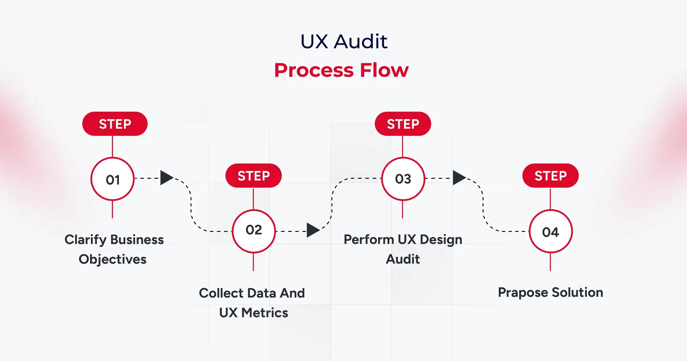
User Testing Validates What Analytics and Expert Review Cannot Prove

Heuristic evaluation and usability testing answer different questions. It is fast and cost-efficient for expert diagnosis. On the other hand, task-based testing with five representative users reveals internal friction that teams overlook.

Use task scripts tied to conversion intent: find pricing, submit a lead form, complete checkout, recover from an input error, and locate policy reassurance. Then compare observed friction against analytics drop points and fix the priority list.

This is where a website conversion audit matures into confidence in decisions. You move from “we think this is better” to “users completed the task faster, with fewer errors, on the pages that matter.”

Conclusion

A strong WordPress audit sequence is clear: goals first, then analytics, then CWV, mobile UX, forms and checkout, accessibility, prioritized fixes, and user validation. That framework gives business owners and growth teams an execution roadmap, not a generic design critique.

A UX website audit is most valuable when it ends with accountable implementation decisions, which is exactly where experienced UI/UX design and development services deliver measurable lift in leads and sales.
Top 7 UI/UX Design Trends in B2B Websites

In the B2B landscape, first impressions are often digital. Your website speaks before your team does.

With buyers conducting extensive online research before ever speaking to a sales team, your website’s user experience (UX) plays a critical role in shaping trust, clarity, and conversion.

According to a report, 90% of B2B buyers will switch to a competitor if a supplier’s digital experience doesn’t meet expectations. This highlights a growing reality: functional design isn’t enough—your website must also be intuitive, engaging, and built around the user.

Why Great UI/UX Is No Longer Optional for B2B Brands

A website is no longer just a support function. It’s a strategic business asset—often the first real interaction a potential client has with your brand. And in that moment, design isn’t about decoration. It’s about how your business thinks, communicates, and earns trust.

While products and pricing still matter, the way you deliver clarity, reduce friction, and guide decisions through your digital experience is what sets you apart. That’s where UI/UX becomes critical—not as a design checklist, but as a reflection of how seriously you take your customers’ time and attention. Here’s what businesses need to recognize:

Your Buyers are Judging Long Before They Engage

Decision-makers often land on your site with a specific intent—looking for answers, confidence, or a sign you “get it.” Good UX doesn’t just help them find what they need—it reassures them they’re in the right place.

Digital Experience = Perceived Value

A seamless interface subtly says: “We’ve thought this through.” A confusing or clunky site, on the other hand, quietly signals a lack of care, even if your actual offering is solid.

Modern Design Is Modern Thinking

Following current UI/UX trends isn’t about looking trendy—it shows your company is tuned in, adaptive, and forward-moving. That’s the kind of partner clients want to work with.

It Impacts Business Outcomes Directly

Efficient user flows, responsive layouts, and intuitive design reduce drop-offs, shorten sales cycles, and even influence how your sales team is perceived when a lead finally reaches out.

Basically, investing in smart UI/UX is investing in how your business is experienced and remembered.

The trends we’re about to explore aren’t just design updates. They’re part of a broader shift in how successful B2B brands are choosing to show up digitally—with clarity, empathy, and strategic intent.

Trend #1. Minimalist & Conversion-Focused Layouts

Complexity often creeps in unintentionally. Multiple stakeholders, layered service offerings, and long-form content can lead to cluttered interfaces that confuse rather than convert.

That’s why minimalist UI design—when combined with conversion-focused UX thinking—has become a powerful design trend in the B2B space.

But let’s understand that minimalist doesn’t mean empty or oversimplified. It means removing distractions so that what truly matters stands out—your value proposition, your trust signals, and your conversion paths.

B2B buyers are goal-driven. They’re often pressed for time and want fast access to relevant insights, not to wade through jargon or excessive visuals.

Minimalist design helps reduce cognitive load. The more you simplify the experience, the easier it is for decision-makers to say “yes.”

Clean layouts guide the eye toward CTAs, lead capture forms, demo buttons, or product documentation.

What does a minimalist, conversion-focused layout look like?

  • Clear hierarchy of information (headlines, subheads, short content blocks)
  • Generous white space that enhances focus and calm
  • High-contrast buttons with a single, strategic CTA per section
  • Limited color palettes that align with your brand’s tone
  • Decluttered menus with intent-based navigation

It’s a quiet but powerful signal that says:

“We respect your time, we know our value, and we’re here to make your decision easier.”

Trend #2. Personalization & AI-Driven Experiences

Relevance is everything. Buyers come to your website with different goals, backgrounds, and levels of urgency. A CTO may be looking for technical documentation, while a marketing lead wants case studies and ROI insights.

When your website delivers the same generic experience to everyone, it misses the opportunity to truly connect.

What does personalization in B2B UI/UX look like?

  • Smart content modules that adapt based on user behavior, industry, or job role
  • Dynamic CTAs that reflect the stage of the buyer journey
  • AI-powered chatbots or assistants offering tailored support in real time
  • Customized dashboards or portals for existing clients or partners

Personalization removes friction by helping users get to the information they need faster. Decision-makers want efficiency.

AI enables scale. Machine learning tools help B2B websites adapt in real time without constant manual intervention.

Tailored journeys build trust. When visitors feel seen and understood, they’re more likely to engage, explore, and eventually convert.

Trend #3. Micro-Interactions for Engagement

Micro-interactions are the small, sometimes overlooked elements of design that give digital interaction a sense of responsiveness, intuitiveness, and humanity.

Think of a subtle hover effect, a form field that highlights when clicked, or a gentle animation when a button is pressed.

Although these animations appear insignificant, they hugely contribute to B2B UI/UX design, particularly in an area where it’s harder to gain engagement.

Where micro-interactions show up in B2B UX:

  • Navigation cues that show progress (like a progress bar during form fills or onboarding steps)
  • Card hover effects, button hover effects, chart hover effects that show additional information without clicking
  • Real-time feedback upon an action (e.g., “Form submitted successfully,” “Copied to clipboard,” “Added to dashboard”)
  • Animated transitions that direct the eye’s attention across one portion to the next

Micro-interactions are not decorative; they’re strategic. They’re a way to say: “We’ve thought about the details because we care about how people experience our brand.”

These interactions might not be called out in a boardroom, but they’re felt in every click, every form, every page transition. And they leave a lasting impression.

Trend #4. Mobile-First, Performance-Optimized Design

It’s easy to assume that most digital experiences happen on a desktop. But the reality tells a different story. Decision-makers are increasingly browsing solutions, reviewing proposals, and even initiating vendor conversations via mobile.

Whether it’s a quick glance during a commute or reviewing a demo link between meetings, mobile-first UX design has become essential, not optional.

But mobile-first doesn’t just mean “responsive.” It means designing from the smallest screen up, making speed, clarity, and actionability the core pillars of your experience.

After all, mobile is part of the buying journey. A CFO might check your pricing page on a tablet. A tech lead might review your capabilities via mobile before looping in their team.

Google ranks you based on mobile performance. Core Web Vitals now directly impact SEO, affecting visibility in competitive B2B markets.

First impressions happen fast. If your mobile experience lags or feels broken, the assumption is that your service might be the same.

What does a mobile-first, performance-optimized UI/UX look like?

  • Prioritized content hierarchy for small screens—headline, value, CTA
  • Thumb-friendly interactions, sticky CTAs, and collapsible menus
  • Compressed media, optimized images, and lazy loading for speed
  • Performance-focused code and reduced dependencies for fast load times

Think of mobile-first design not just as a design principle, but as a commitment to meeting your buyer where they are.

Trend #5. Advanced Data Visualization & Storytelling

B2B decisions are built on data. But here’s the challenge: presenting data isn’t the same as communicating value.

Your audience doesn’t just want to see numbers—they want to understand what those numbers mean for them. That’s where advanced data visualization and narrative-driven UI/UX design come into play.

It’s about using visual hierarchy, interaction, and storytelling to help users make sense of information—faster and more confidently.

When your site presents complex information in a way that’s not just digestible—but engaging—you’re not just informing buyers. You’re empowering them.

What this looks like in modern B2B UX:

  • Interactive dashboards that allow users to filter and explore metrics based on their interests
  • Animated infographics that explain concepts step-by-step
  • Scroll-based storytelling that connects data points to real-world outcomes
  • Side-by-side comparisons, ROI simulators, or industry benchmarks embedded in product or service pages

Data is your strongest proof, but without clarity, it becomes noise. A well-visualized insights help teams justify buying decisions internally. And moreover, strategic storytelling turns technical content into persuasive narratives.

Trend #6. Accessibility & Inclusive Design

Inclusive UX design is becoming a non-negotiable. It’s not just about compliance—it’s about values, reach, and long-term sustainability.

Whether your users are navigating with assistive technologies, dealing with temporary limitations (like low bandwidth or a cracked screen), or simply prefer different interaction styles, your website should offer a consistently smooth, respectful experience for all.

What accessibility in B2B web design looks like:

  • Clear visual contrast between text and background for readability
  • Keyboard navigation and screen reader compatibility
  • Alt-text for images, semantic HTML, and ARIA roles for clarity
  • Transcripts or captions for video and audio content
  • Logical, predictable navigation and form flows

Accessible sites are often better for everyone. Simpler navigation, clear content, and fast performance benefit all users—not just those with specific needs.

In addition to this, regulations are tightening. Accessibility standards (like WCAG 2.2) are increasingly being baked into legal and procurement requirements—especially in enterprise and government contracts.

Above all, investing in accessibility shows your business is mature, thoughtful, and built for scale.

Trend #7. Video & Interactive Product Demos

No matter how well-crafted your messaging is, there’s a point where your buyers want to see the product in action, experience the flow, or understand how your solution fits into their world.

That’s why video walkthroughs and interactive demos have become a major UX trend across high-performing B2B websites.

They turn passive viewers into active participants—and that’s where confidence starts to build.

What this looks like in modern B2B UI/UX:

  • Short explainer videos on key pages (homepage, product, pricing, use cases)
  • Interactive demos that allow users to click through features, explore interfaces, or simulate outcomes
  • Personalized demo experiences tailored by industry or role
  • Embedded video testimonials or scenario-driven product use cases

Video and interactivity aren’t about looking flashy—they’re about meeting your buyers where they are: curious, busy, and skeptical.

When your website offers a guided experience that feels clear, transparent, and immersive, you’re removing barriers and building trust at the same time.

Avoid These Common UI/UX Pitfalls in B2B Website Design

Adopting the latest UI/UX design trends can elevate your B2B website—but only when applied with clarity, purpose, and user understanding. Without strategic execution, even the most promising trends can backfire, confusing users, hurting conversions, or diluting your brand message.

Here are common mistakes B2B leaders and designers must actively avoid—and what to do instead:

1. Chasing Aesthetics Over Conversions

Over-prioritizing sleek visuals without considering the buyer journey.

Every layout, interaction, or animation should lead users toward a specific business goal—whether that’s requesting a demo, downloading a whitepaper, or booking a call. Keep it conversion-focused, not just pretty.

2. Overusing Personalization Without Value

Implementing AI-driven personalization that feels invasive or irrelevant.

Use user behavior, role-based logic, or firmographics to enhance relevance—but always give users control. Respect privacy and keep personalization subtle and helpful. Make it feel intelligent, not intrusive.

3. Adding Micro-Interactions Without Intent

Using hover effects, animations, and transitions that serve no functional purpose.

Micro-interactions should reinforce clarity—highlight a CTA, validate form inputs, or show feedback. Avoid flashy distractions that hinder usability. Delight through simplicity, not gimmicks.

4. Ignoring Mobile Optimization

Designing desktop-first and trying to retrofit it for mobile later.

Adopt a mobile-first UI design approach from day one. B2B buyers are increasingly on mobile—ensure fast load times, thumb-friendly CTAs, and clean navigation. Mobile is not secondary—it’s primary.

5. Overcomplicating Data Visualizations

Presenting charts or dashboards that look impressive but confuse decision-makers.

Use visual storytelling to break down complex data into actionable insights. Choose clarity over cleverness. Highlight trends, not just numbers. Your data should talk, not puzzle.

Trends are only effective when anchored in strategy and empathy. Also, it is important to stay aligned with what your users actually need to move forward confidently.

How to Choose UI/UX Trends That Fit Your B2B Needs

With so many UI/UX design trends making waves, it’s tempting to apply them all. But in B2B, success lies not in how many trends you follow, but in how well they align with your customer experience goals, buyer intent, and industry context.

Here’s how to choose the right UI/UX elements for your B2B website—smartly, intentionally, and impactfully:

Start with Your Buyer Journey

Start by asking: What are your visitors looking for when they land on your site?

Your UX should guide them—intuitively—from awareness to trust to action. Whether they’re exploring solutions, comparing vendors, or ready to request a quote, your design choices should meet them where they are.

Use trend elements like micro-interactions or data visualization to simplify complex buying decisions, not overwhelm them.

Match Trends to Business Goals

Not every interaction needs a trend. Some need clarity.

If your priority is more demo sign-ups, consider minimalist layouts with clear CTAs. If you want to showcase product complexity, invest in interactive product demos or video walkthroughs.

Align every UI/UX element with a measurable outcome—lead quality, engagement time, or conversion rate.

Stay Future-Focused, But User-Centered

A trend is only valuable if it enhances user experience for the long haul.

Look beyond visual appeal. Will this trend scale as your product evolves? Does it improve accessibility? Will it work seamlessly across devices?

Conduct UX audits regularly. A professional B2B UI/UX design partner can help you evaluate what’s working and what’s just noise.

Prioritize Performance & Personalization

Speed, relevance, and smooth interaction are non-negotiable.

If your B2B users are enterprise clients or time-strapped professionals, the design must perform fast, feel personalized, and avoid friction.

Consider tools like AI-driven personalization or mobile-first design frameworks—implemented by teams that understand the tech and the psychology behind them.

When in Doubt, Test—Then Optimize

No trend should go live without validation.

Even small changes in design can shift engagement drastically. A/B test your UI elements, collect heatmaps, and gather user feedback to refine experiences iteratively.

Partner with a team that offers continuous UX optimization—not just one-time design.

Future Trends in UI/UX Every B2B Website Should Watch

Agentic AI & Generative Interfaces – Interfaces that proactively assist users by generating content, suggestions, and decisions using AI.

Voice, Ambient & Zero-UI Experiences – Seamless interactions using voice or background automation—no buttons, just intuitive actions.

Spatial Computing & AR-Driven Visuals – Blending physical and digital worlds with immersive, 3D experiences using AR and spatial tech.

Predictive UX Powered by Real-Time Analytics – Smart interfaces that anticipate user needs before they act, reducing friction and improving flow.

Final Thought

Trends will come and go, but great UI/UX design is about knowing which ones to lean into, and when to say no. Especially in B2B, where the goal isn’t just to look good—it’s to build trust, speed up decisions, and quietly guide users toward the right action.

If you’re at a stage where your site needs to not just look better but perform better, now might be the right time to explore what thoughtful, strategic UI/UX design services can do for your business. Because in a B2B world where attention is earned, experience speaks louder than words.

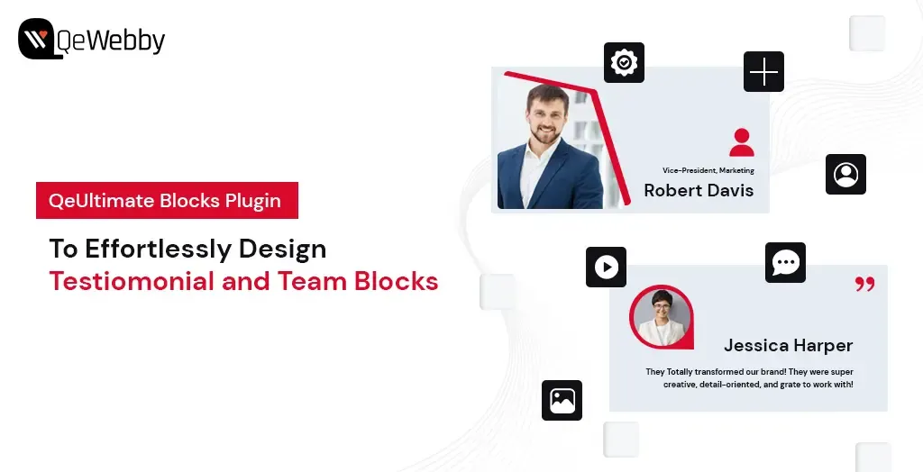
Effortlessly Design Testimonial and Team Blocks with QeUltimate Blocks Plugin

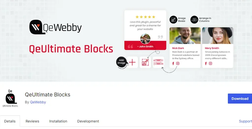
The QeUltimate Blocks Plugin for WordPress is a game-changer for anyone looking to create stunning, functional web pages with ease. Designed to enhance the Gutenberg editor, this plugin offers a variety of customizable blocks for testimonial and team member display that can transform your website without the need for complex coding or expensive design services.

Whether you’re a blogger, a business owner, or a creative professional, QeUltimate Blocks empowers you to craft pages that are not only aesthetically pleasing but also incredibly user-friendly. With an array of options to customize fonts, colors, backgrounds, and more, you have full control over every design element. Plus, the intuitive drag-and-drop interface means you can build and arrange your pages in no time, focusing on what you do best—creating outstanding content.

But that’s not all. QeUltimate Blocks enhances the visitor experience with features that promote easy navigation and engagement, such as interactive buttons and forms. Fully compatible with WordPress, this plugin seamlessly integrates with your existing setup, allowing you to easily expand your site’s capabilities.

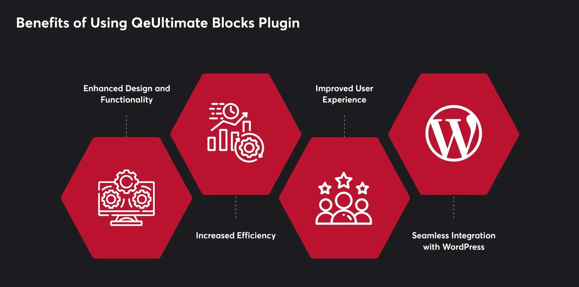
Benefits of Using QeUltimate Blocks Plugin

The QeUltimate Blocks Plugin significantly improves website design and functionality. With a variety of customizable blocks, users can create visually appealing and user-friendly pages. The plugin offers easy customization of fonts, colors, backgrounds, and other design elements, giving users complete control over their website’s appearance.

QeUltimate Blocks streamlines the page creation process with its intuitive drag-and-drop interface. Users can quickly add and arrange blocks without coding or technical skills, saving time and effort. This efficiency allows users to focus more on creating quality content for their website.

The plugin enhances the user experience by making website navigation and readability straightforward. Visitors can easily find the information they need, and interactive elements such as buttons and forms help increase user engagement and drive conversions.

QeUltimate Blocks is fully compatible with WordPress, making it easy to integrate into existing websites. Users can install the plugin directly from the WordPress repository and start building pages immediately. Additionally, the plugin works seamlessly with other WordPress plugins, enabling users to add further functionality to your websites.

3 Easy Steps to Add Testimonial and Team Blocks on WordPress Pages

Step 1: Install and Activate QeUltimate Blocks Plugin

Get QeUltimate Blocks Plugin for Free!

Craft Stunning Web Pages –

Free Download

Whether you want to improve your site’s design, enhance SEO, or add interactive elements, plugins provide a simple solution. One such powerful plugin is the QeUltimate Blocks Plugin, designed to help you effortlessly create stunning and functional pages. Here’s a detailed guide on how to install and activate the QeUltimate Blocks Plugin.

Log in to Your WordPress Dashboard: Open your web browser and navigate to your WordPress admin panel by adding /wp-admin to your site’s URL (e.g., www.yoursite.com/wp-admin). Enter your username and password to log in.

Go to Plugins: Once logged in, look at the menu on the left-hand side of the dashboard. Find and click on “Plugins” to open the Plugins management page.

Add New Plugin: At the top of the Plugins page, you will see a button labeled “Add New.” Click on this button to navigate to the Add Plugins page where you can search for and install new plugins.

Install the Plugin: Once you find the QeUltimate Blocks Plugin in the search results, click the “Install Now” button next to it. The installation process will begin, and the button will display a progress indicator.

Activate the Plugin: After the plugin has been installed, the “Install Now” button will change to “Activate.” Click on the “Activate” button to enable the plugin on your WordPress site.

Confirmation: After activation, you will be redirected back to the Plugins page, and a message at the top will confirm that the QeUltimate Blocks Plugin has been successfully activated.

 Step 2: Explore and Utilize QeUltimate Blocks Features

Now that you have installed and activated the QeUltimate Blocks Plugin, it’s time to explore its powerful features and see how you can utilize them to create stunning and functional web pages. QeUltimate Blocks provides a diverse set of blocks designed to meet various needs, including content structuring, interactivity, and visual enhancement. Here are some of the key blocks you can use:

Key Block: Team Members

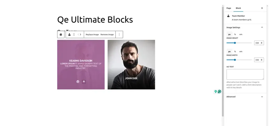
The “Team Members” block is a powerful feature of the QeUltimate Blocks Plugin that enables you to create an attractive section dedicated to showcasing your team. This block is perfect for highlighting the individuals behind your business, project, or organization, adding a personal touch to your website. The basic features include:

  • Go to the Post/Page Editor: From your WordPress dashboard, navigate to Posts or Pages and create a new post/page or edit an existing one.
  • Open the Block Inserter: In the Gutenberg editor, click on the “+” button to open the Block Inserter menu.
  • Find the Team Members Block: Scroll through the QeUltimate Blocks section or use the search bar to locate the “Team Members” block.
  • Add the Block: Click on the “Team Members” block to add it to your post or page.
  • Customize the Block: Once added, you can customize the block using the settings panel on the right-hand side of the editor. Here’s how:
    • Add Team Members: Start by adding individual team members. For each member, you can input their name, position, and a brief bio.
    • Profile Pictures: Upload profile pictures for each team member to add a personal touch.
    • Social Media Links: Include links to social media profiles or personal websites. You can add icons for platforms like LinkedIn, Twitter, and Facebook.
    • Layout Options: Choose from different layout styles, such as grid or list, to best present your team members.
    • Styling Options: Customize colors, fonts, and spacing to ensure the section aligns with your website’s design.
    • Arrange Team Members: Drag and drop team members to arrange them in the desired order. This helps highlight key individuals or create a logical flow.
  • Preview Your Page: Click the “Preview” button to see how the team section looks. Check for any adjustments needed to ensure it is visually appealing and informative.
  • Publish Your Page: Once you are satisfied with the design and layout, click the “Publish” button to make your page live.

Key Block: Testimonials

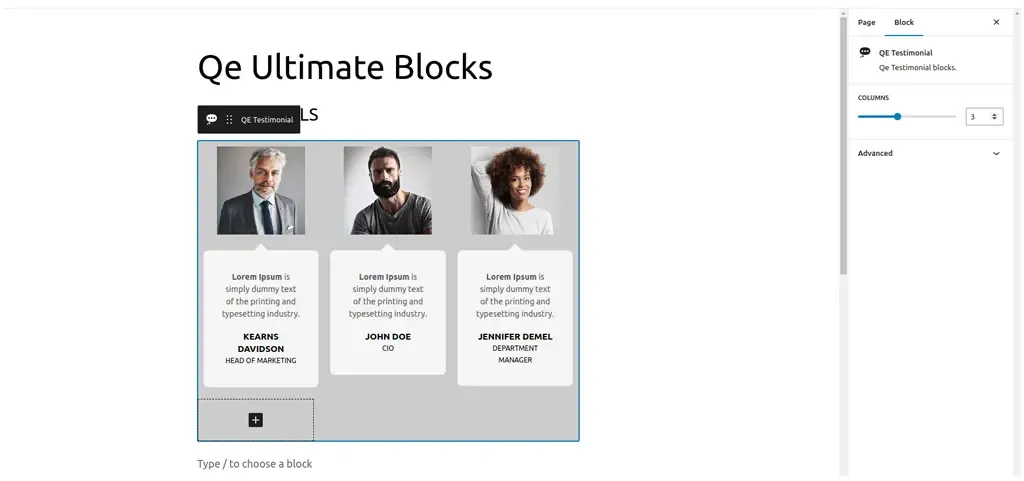
The “Testimonials” block is an essential feature for showcasing positive feedback from your customers. Testimonials serve as social proof, helping to establish trust and encouraging potential customers to engage with your business. The QeUltimate Blocks Plugin makes it easy to create and customize testimonial sections that stand out. The basic features include:

  • Customizable Layouts: Choose from various layout options, including grid, slider, and list formats.
  • Profile Information: Display the name, position, company, and photo of each testimonial provider.
  • Styling Options: Customize colors, fonts, backgrounds, and borders to match your website’s design.
  • Responsive Design: Ensure testimonials look great on all devices, from desktops to mobile phones.

Here is a step-wise guide to implement:

  • Go to the Post/Page Editor: From your WordPress dashboard, navigate to Posts or Pages and either create a new post/page or edit an existing one.
  • Open the Block Inserter: In the Gutenberg editor, click on the “+” button to open the Block Inserter menu.
  • Find the Testimonials Block: Scroll through the QeUltimate Blocks section or use the search bar to locate the “Testimonials” block.
  • Add the Block: Click on the “Testimonials” block to add it to your post or page.
  • Customize the Block: Once added, you can customize the block using the settings panel on the right-hand side of the editor. Here’s how:
    • Add Testimonials: Start by adding individual testimonials. For each testimonial, input the customer’s name, position, company, and their feedback.
    • Profile Pictures: Upload a photo of the customer to add authenticity and a personal touch.
    • Layout Options: Choose the layout style that best fits your design—grid for a clean, structured look, slider for a dynamic presentation or list for a straightforward approach.
    • Styling Options: Adjust colors, fonts, and backgrounds to ensure the testimonial section aligns with your website’s overall design. You can also add borders and shadow effects to enhance the visual appeal.
    • Display Options: Customize how many testimonials to display at a time and whether to include navigation arrows or dots if using a slider layout.
    • Arrange Testimonials: Drag and drop testimonials to rearrange their order as needed. Highlight the most impactful testimonials at the top for maximum effect.
  • Preview Your Page: Click the “Preview” button to see how the testimonial section looks on your site. Ensure it is visually appealing and the text is easy to read.
  • Publish Your Page: Once you are satisfied with the design and layout, click the “Publish” button to make your page live.

Step 3 Design and Publish Your Stunning Page

You are now ready to design and publish your stunning WordPress page. This final step involves putting together all the elements you’ve customized, arranging them for the best visual impact, and ensuring your page is ready to captivate your audience. Here’s a detailed guide on how to design and publish your beautiful, functional page.

Here is a step-wise guide to implement:

  • Outline Your Content: Before you start designing, outline the key sections and elements you want on your page. This could include a header, hero image, team section, testimonials, a call-to-action, and footer.
  • Sketch a Layout: Sketch a rough layout of your page on paper or using a digital tool. This helps you visualize the structure and flow, making it easier to arrange blocks later.
  • Go to the Post/Page Editor: From your WordPress dashboard, navigate to Posts or Pages and create a new post/page or edit an existing one.
  • Add a Title: Start by adding a compelling title that clearly conveys the purpose of your page.
  • Add and Arrange Blocks: Using the “+” button, add the blocks you’ve outlined in your plan. Arrange them in the order that follows your sketched layout. Here are some key sections you might include:
    • Hero Section: Use an Image or Cover block to create a visually striking hero section. Add a headline and a subheadline that grabs attention.
    • Team Members: Use the Team Members block to introduce your team. Customize it with profile pictures, names, and bios.
    • Testimonials: Add a Testimonials block to showcase positive feedback. Customize the layout and design for maximum impact.
    • Call to Action: Use the Call to Action block to encourage visitors to take a specific action, like signing up for a newsletter or contacting you.
    • Customize Each Block: Adjust the settings for each block to match your design preferences. This includes changing colors, fonts, spacing, and adding background images where needed.
  • Add Media: Enhance your page with high-quality images, videos, and graphics. Use the Image Slider block for interactive galleries or the Video block to embed engaging video content.
  • Use Advanced Columns: For a more sophisticated layout, use the Advanced Columns block to create multi-column sections. This can help organize content and improve readability.
  • Ensure Consistency: Maintain a consistent design throughout your page. Use the same fonts, colors, and styles to create a cohesive look.
  • Preview Your Page: Click the “Preview” button to see how your page looks on different devices. Check for any alignment issues, broken links, or design inconsistencies.
  • Optimize for SEO: Use an SEO plugin to optimize your page title, meta description, and content. This helps improve your page’s visibility in search engine results.
  • Test Functionality: Ensure all interactive elements, like buttons and forms, work correctly. Test any links to make sure they direct to the intended pages.
  • Save Draft: Before publishing, save your page as a draft. This ensures you don’t lose any work and can make final adjustments.
  • Publish: Once you’re satisfied with the design and functionality, click the “Publish” button to make your page live. Confirm any prompts to finalize the publication.
  • Promote Your Page: Share your newly published page on social media, in newsletters, and through other marketing channels to drive traffic.

End Note

The QeUltimate Blocks Plugin offers a range of customizable blocks that cater to various needs, from showcasing team members and displaying testimonials to creating advanced layouts and interactive elements. These features enable you to build professional, user-friendly pages without needing extensive coding skills. Now that you have the knowledge and tools to craft stunning WordPress pages, it’s time to unleash your creativity and make your website stand out. Happy designing!

QeUltimate Blocks Plugin!

Enhance your website’s design and functionality effortlessly with the

Free Download